
Wild Writers Literary Festival
Role: UI/UX Designer
Duration: May 2023 to Dec 2023
Skills: UI/UX Design & Research, Development
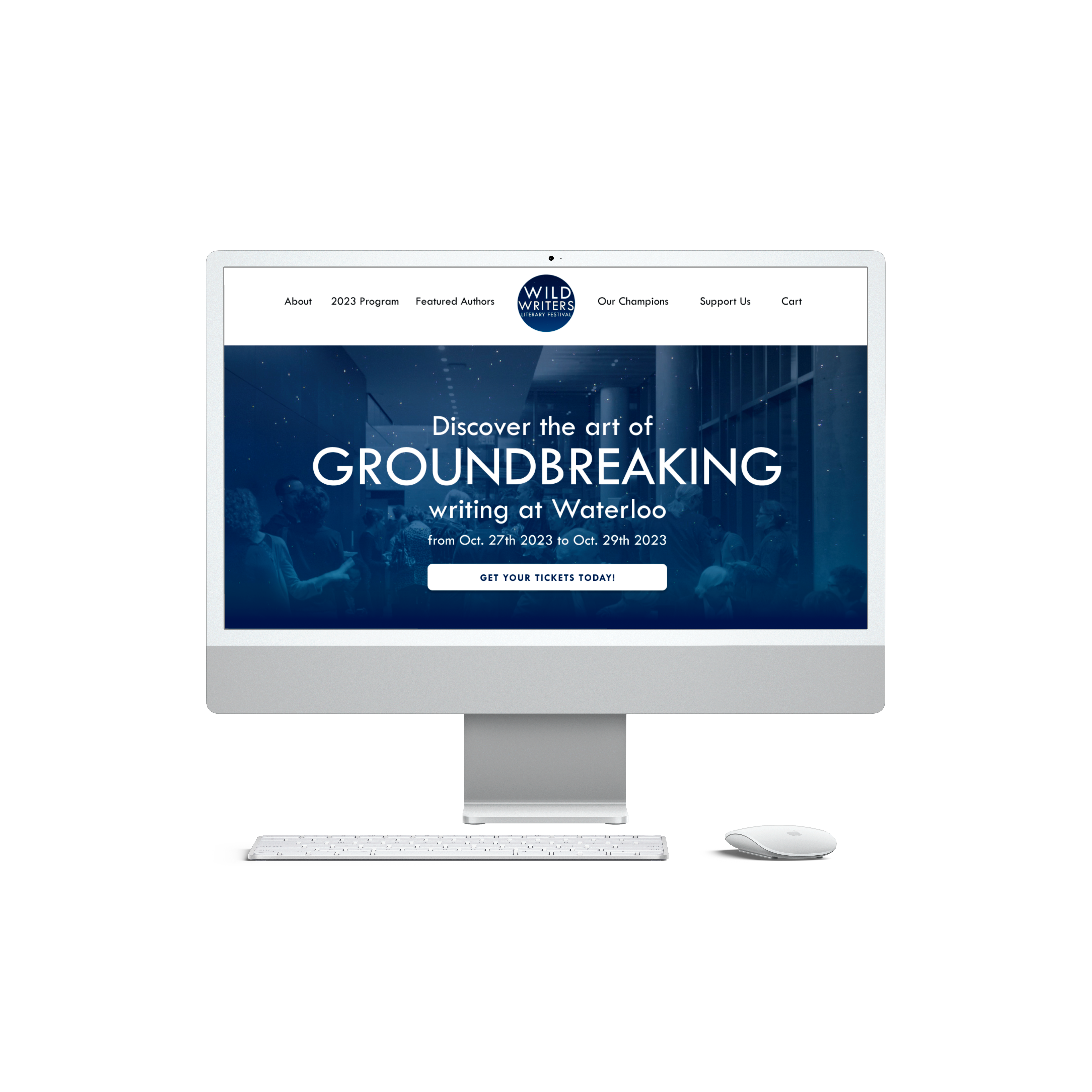
In the Summer of 2023, I was hired by the New Quarterly to redesign a website for their annual festival, The Wild Writers Literary Festival. I was tasked with researching, designing and developing the site within a span of four months, and continued my time at the New Quarterly, redesigning other site and landing pages for them.
Why was a redesign needed?
When tasked with redesigning the WWLF website, my initial priority was to familiarize myself with the Wild Writers Festival. What exactly does the festival entail? Who is its target audience? What are the ticket prices? Instead of seeking answers from my colleagues, I opted to explore the existing website independently and through existing users. My aim was to evaluate how effectively the website conveyed information to a newcomer with no prior knowledge of the New Quarterly or the festival and to understand the gripes of current users as well. Based on my individual analysis of the website and surveys with users of the website, the following was revealed:

Findings of UX Audit & Surveys
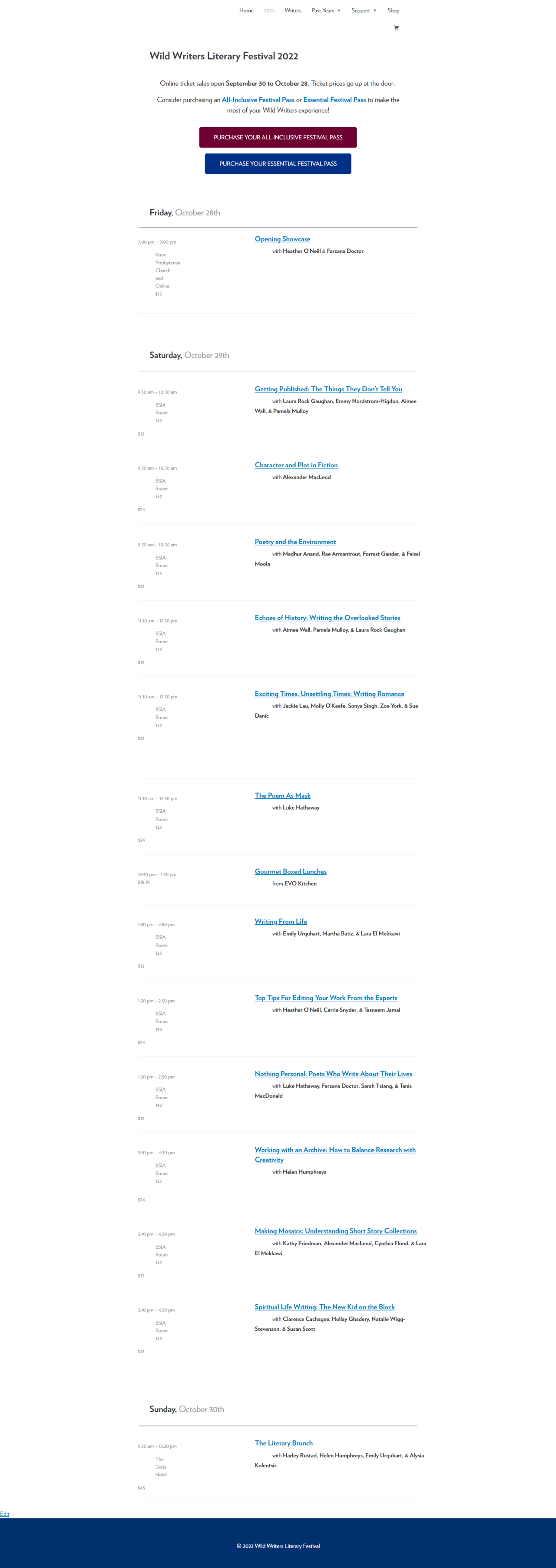
Users struggled to locate festival info
Many users struggled to locate key information regarding the festival such as the location of the event, venue parking, accessible entrances, details of the festival itinerary, and attending authors which can impact a user’s decision to attend the festival.
“Locations with addresses. BSIA means nothing to me. Information about travel, parking, on site or nearby hospitality options, accessibility options, whether gender neutral and family washrooms are available.“
Users weren’t satisfied with the ticket buying process
Users were confused about being able to purchase tickets for sessions occurring simultaneously and mentioned a lack of confirmation post-purchase. This resulted in confusion regarding the events they had initially purchased
“I was frustrated last year with the mix-up re: tickets (pricing/number of sessions to select).”
Users struggled to use the site on their phone
Because of the site’s lack of responsive design, many mobile users faced difficulties viewing festival schedules and purchasing tickets, hindering the overall user experience.
“The itinerary didn’t show up nicely on my phone which meant a lot of scrolling back and forth.”
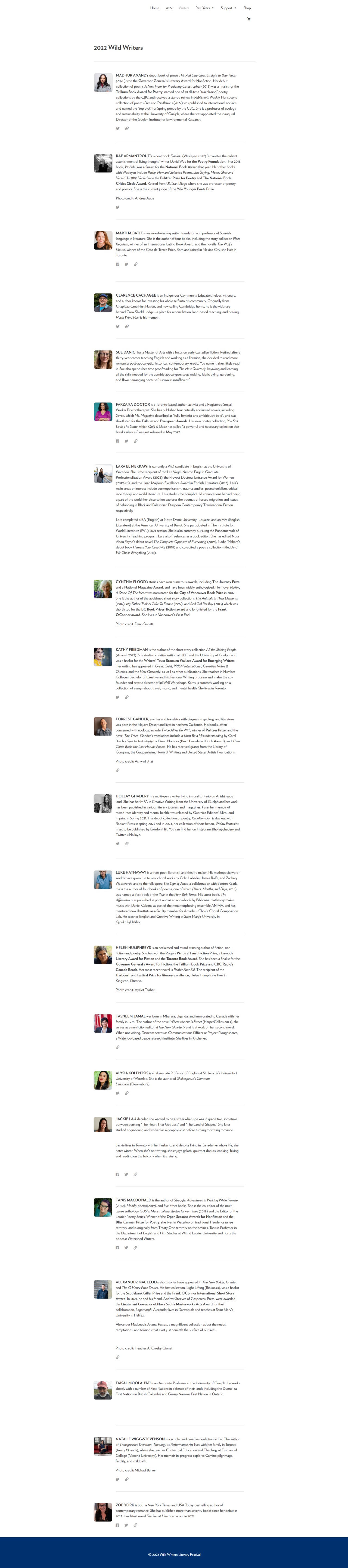
Users wanted to see more visuals
Users also mentioned that they’d like to see more visuals in relation to the festival itself. We at TNQ also felt that photos would be a great way to appeal to potential customers as it showcases the events of the festival.
“PHOTOS! It helps a great deal to see how people are engaged during your panel discussions and workshops.”
The Problem
The Wild Writers Literary Festival website struggled to grow its user base due to unclear information, a complicated ticket process, and poor mobile compatibility, leading to a frustrating user experience and low engagement.
“How might we improve the ticket purchasing process while providing an intuitive user experience?”
1. Improve Information Architecture
The goal of the new website structure was to have more logical and intuitive organization of information. I wanted users to understand exactly what they’ll get when they clicked on a tab in the navigation bar. This clarity was essential in preventing confusion during critical tasks, such as viewing the schedule and purchasing tickets.
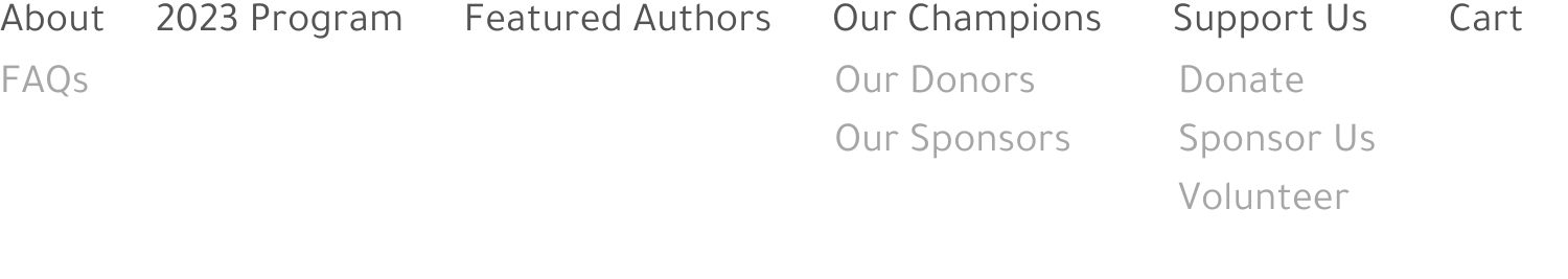
Old Architecture
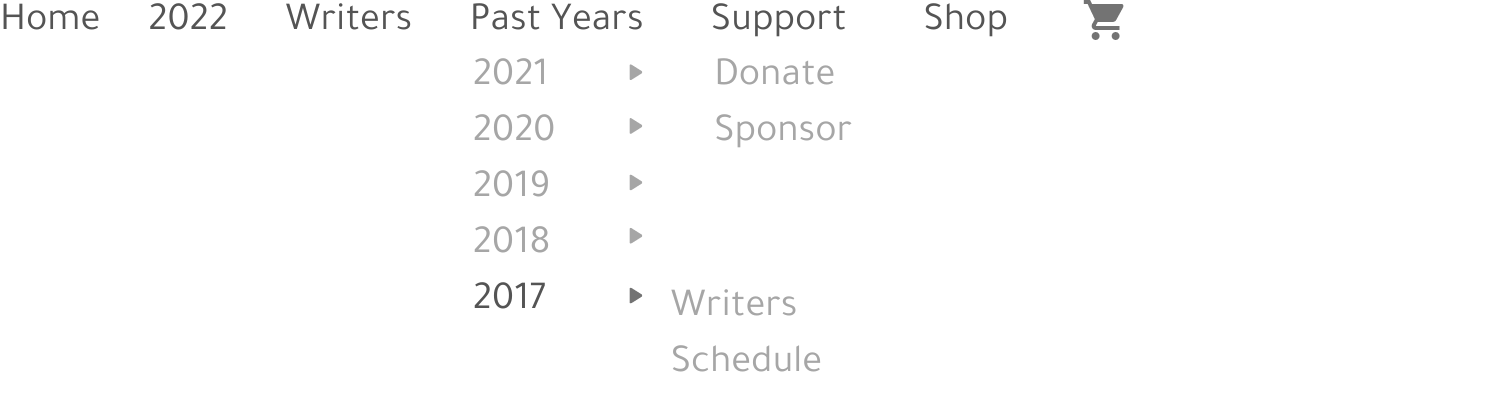
New Architecture
2. Responsive Design
.gif)
With mobile phones being the second most popular device for browsing the site, the need for responsive design was crucial. The current site suffered from:
Poor Mobile Navigation: Users are required to scroll all the way up if they want to access the navigation bar – this can irritate a user during their experience.
Clunky Sections: This prevents users from accessing the information they need in an efficient manner, increasing their scroll time. Sections that use iconography or columns have not been adjusted to display correctly on a mobile page, hindering the ux.
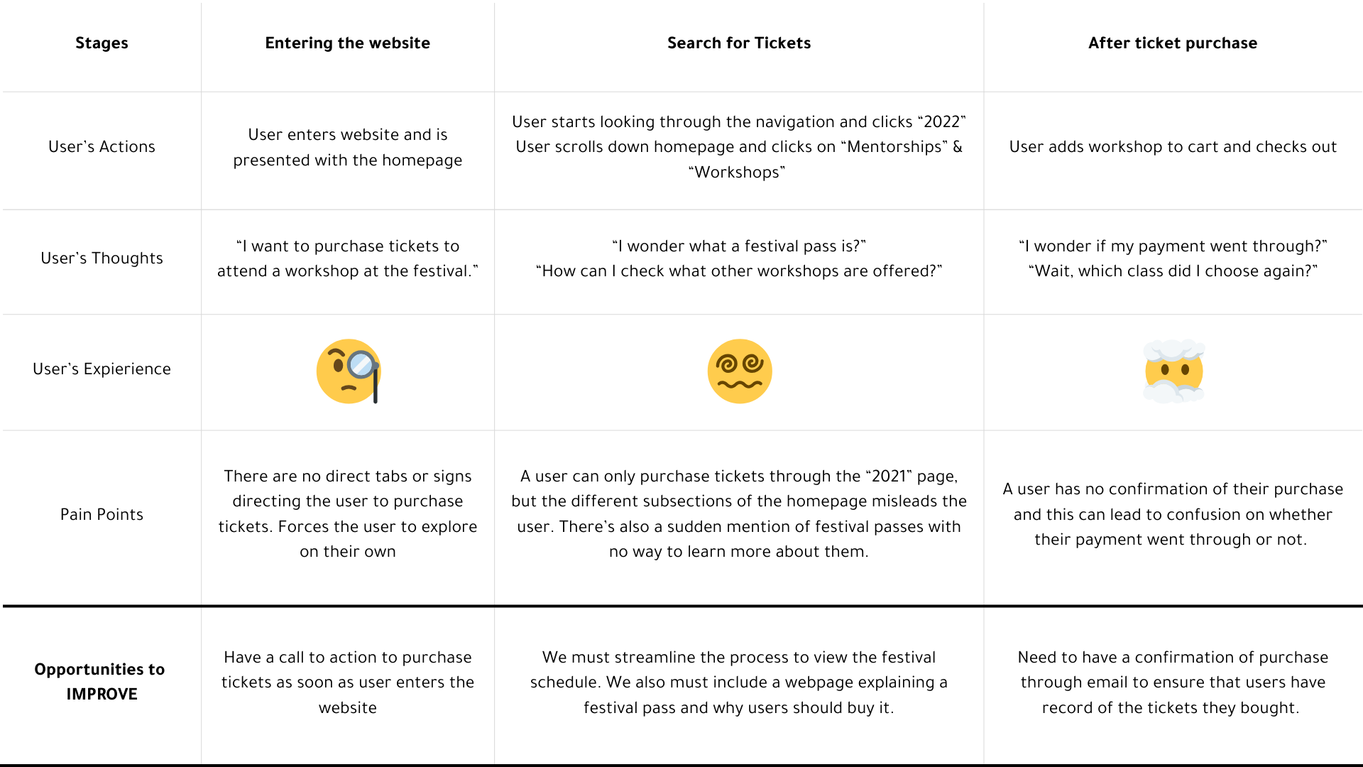
3. Simplify User Journeys
By analyzing the missed opportunities during the current user journey, we were able to determine what our new ticket buying process needed
4. Solidify Imaging & Branding
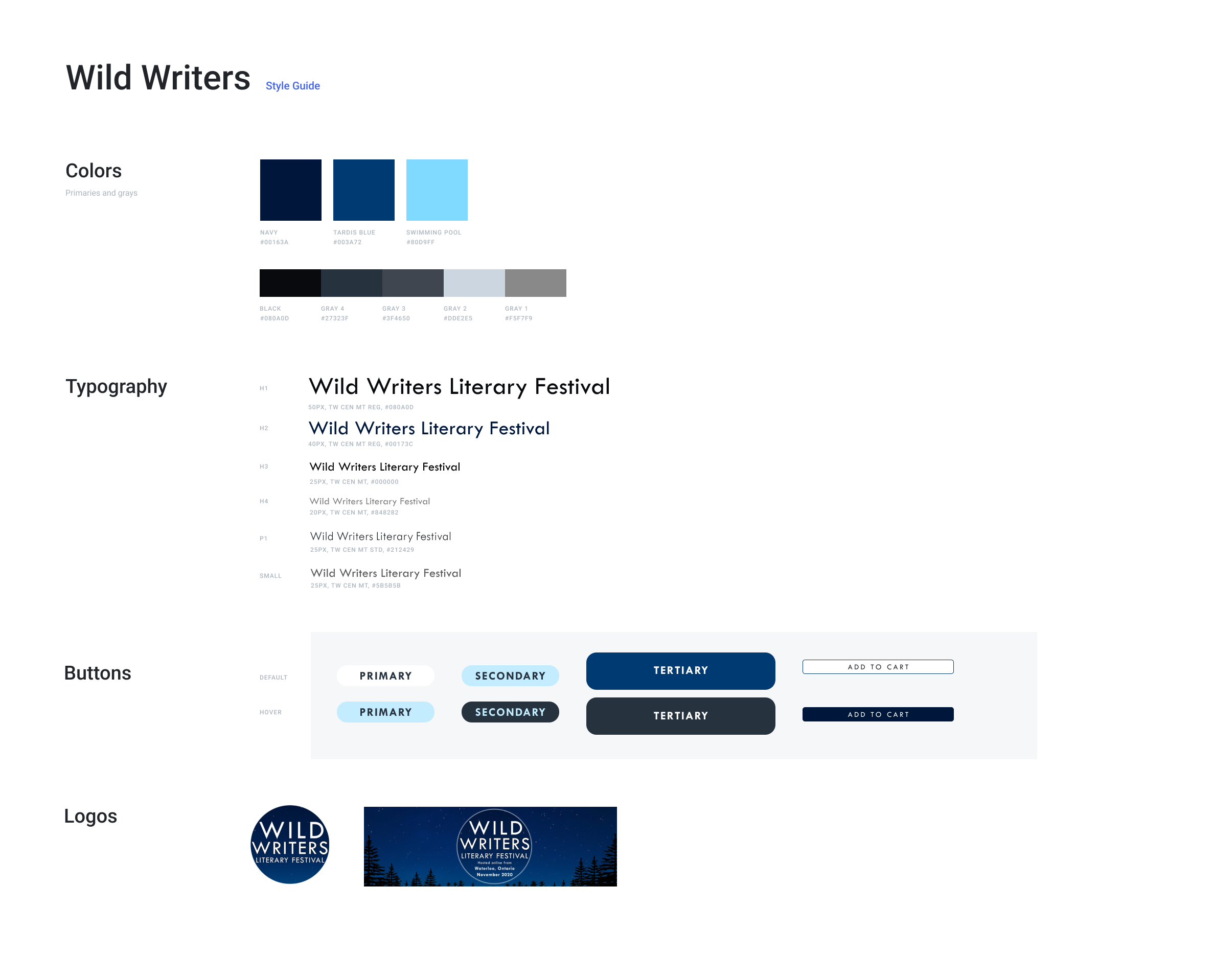
The last objective of the redesign was to solidify the Festival’s branding through pictures, videos, and more information about the organization on the website. We hoped that this would make the festival more recognizable outside our ecosystem and also help build trust with our users. We also anticipated that this increase in credibility would also increase ticket sales as well. I decided to create a design system as I was working on a prototype so that the WWLF website would remain consistent even after my departure.
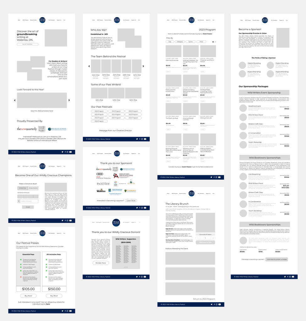
Flow Iterations & Wireframes
With most of my research complete, I then went on to develop two iterations of wireframes. The main changes between the two had to do with the:
- Schedule Page: the inclusion of visuals, a filter option, and condensing layout to present more information
- Branding: organizing information according to company goals (ie. what do we want to include on the “About Us” page)
- Homepage: narrowing down sections to only include key information about tickets, festival date and venue info
High Fidelity & Final Site
Once the TNQ team approved the wireframe, I began working on a few Low Fidelity Prototypes based off of WWLF’s current brand. After looking at all three low fidelities, the team agreed to proceed in the direction that the second iteration was taking.
I then proceeded to turn the second version of the low fidelity into a high fidelity prototype with some minor content/layout changes (click here to view). I also created a mobile version of the site in order to have a guide when developing the website. Once this prototype was approved, I actually started to build the website.
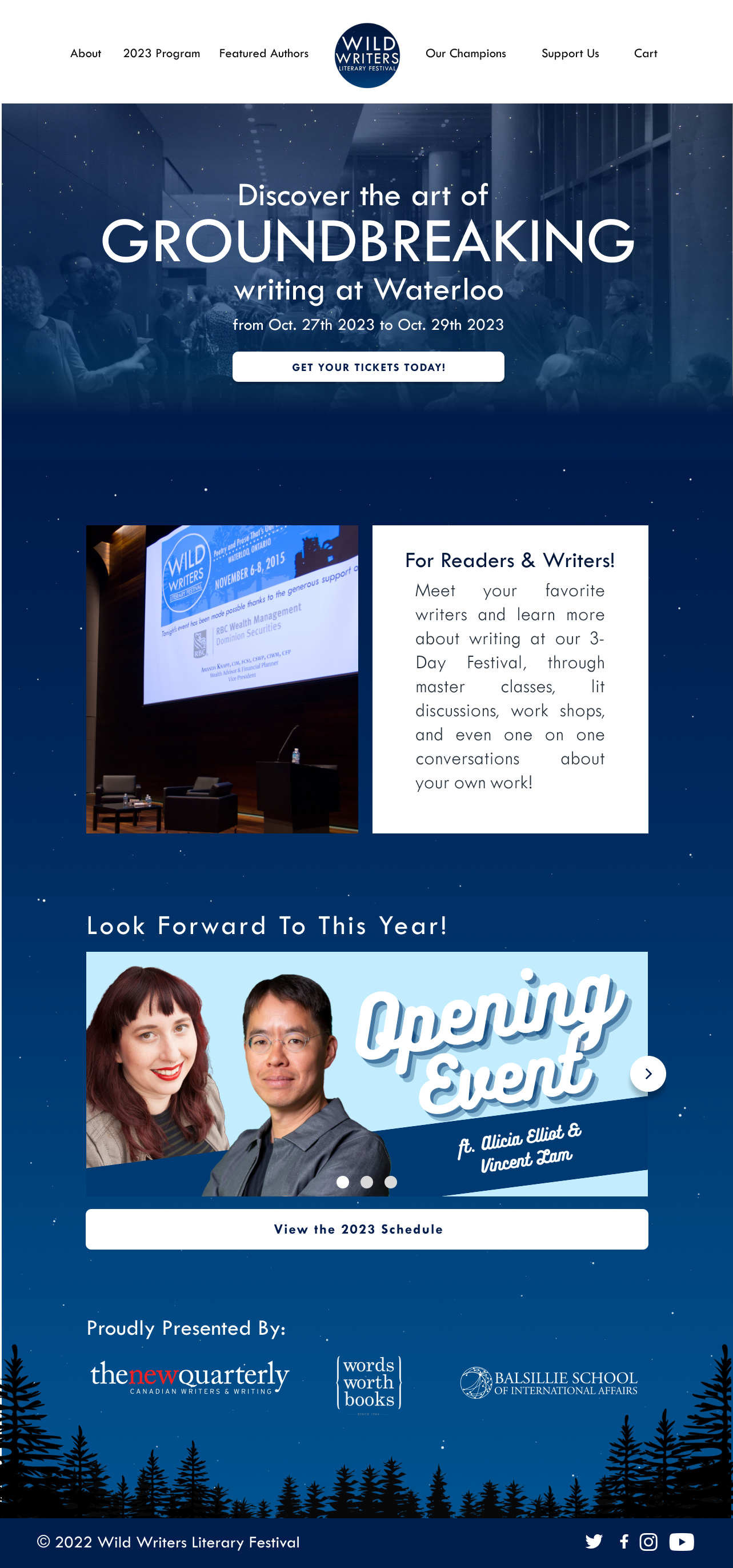
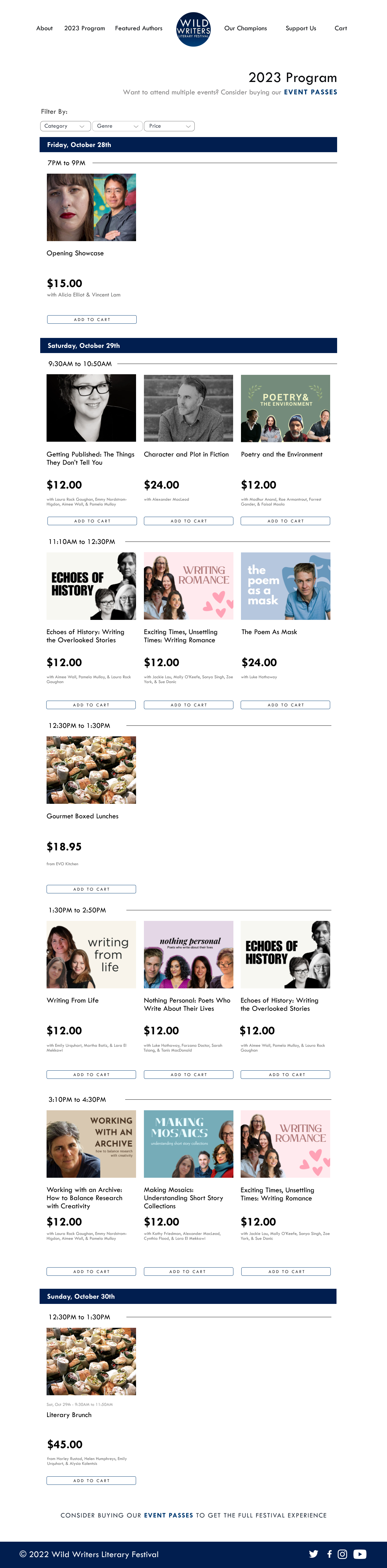
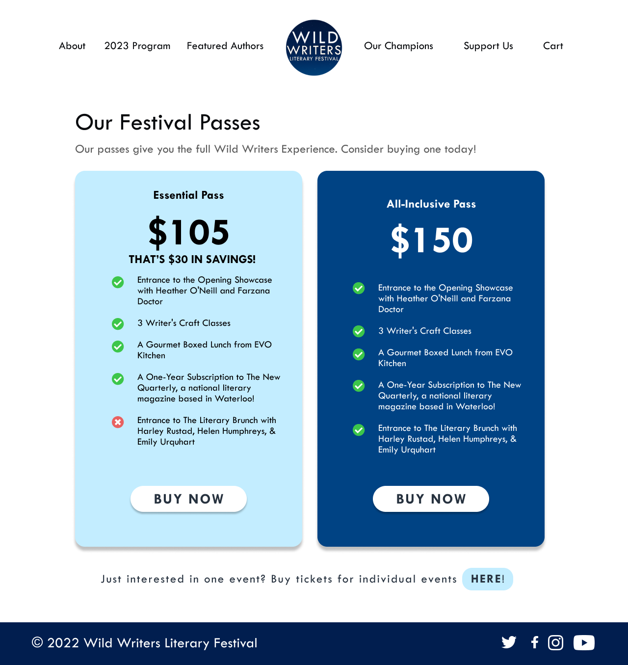
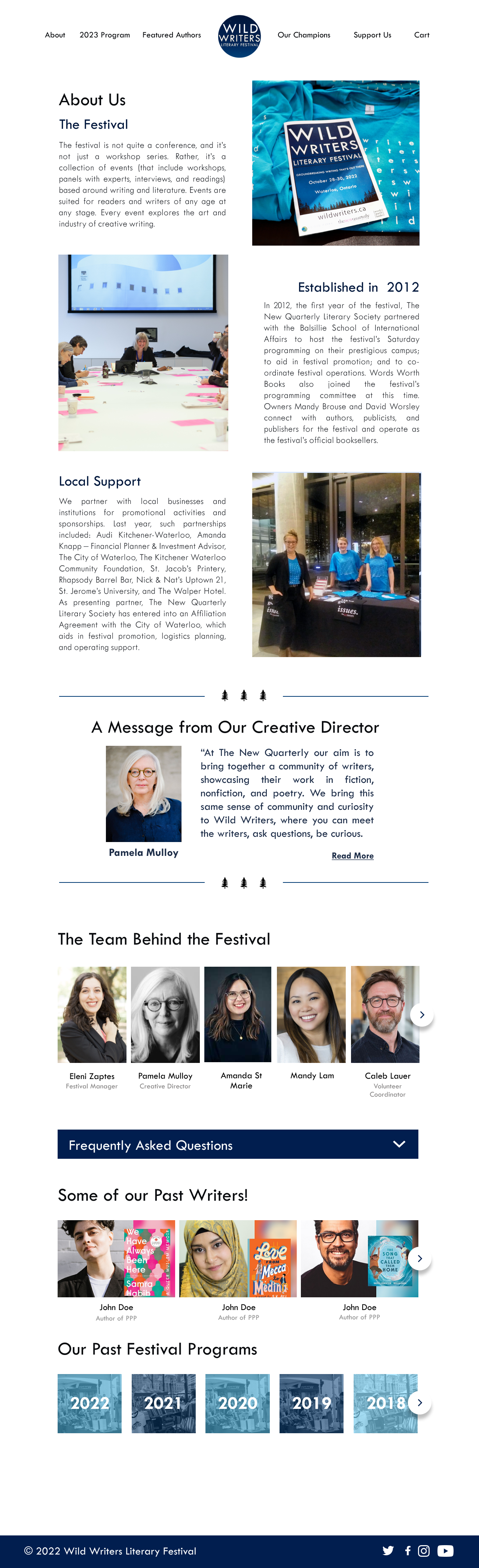
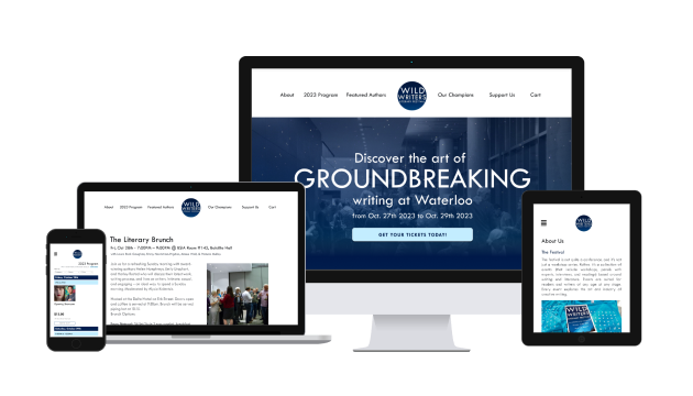
Final Site & Accomplishments
We were able to publish the in August 2023. which you can view here or snapshots of the WWLF site as of January 2024 on the right. I continued my time at TNQ as a part time UI/UX Designer through Fall 2023, and kept website content up to date. The website redesign saw:
10%+
Ticket Sales
$1000+
Donations
$1000+
Sponsorships
Key Learnings & Takeaways
- Website Development: It was a fantastic experience developing a website for actual use. Most of the work I’ve developed previously has strictly been for academic or personal reasons, and this was an amazing way to practice and improve my skills. By developing a better understanding of HTML, CSS, and PHP, I was able to develop a site that was responsive on several devices. This experience helped me create a user-friendly site for not just the users who may browse the site, but for future TNQ workers other than me who may need to change/adjust the site. My greatest learning from this internship was the opportunity to develop a site by myself. It proved to be a great challenge, but rewarding nonetheless. You can see the final Wild Writers Festival Website here.
- Designing for Developers: As UI/UX Designers, we often get caught up in the design process and forget about designing practically. Designers are not only designing for users, but for developers as well. It’s important to understand that your designs must be realistic to implement for developers, and to think about alternative ways in which, we as designers, can create a great yet “easy to implement” design in order to collaborate seamlessly with developers. For this project, I worked as the designer AND developer for this project, so I was put in this situation where I had to adjust my designs more than once. The designs I had created were relatively straightforward, but that still put things into perspective on how I should approach design in the future. Creating a user friendly product would definitely have to require strong communication between design and development teams to get a solid idea of what is actually attainable for the product.
Find something cool?
Keep in touch with the links below!
