Chatime Redesign
Role: Solo Project
Duration: Sept 2024 – Dec 2024
Skills: UI/UX Design & Research
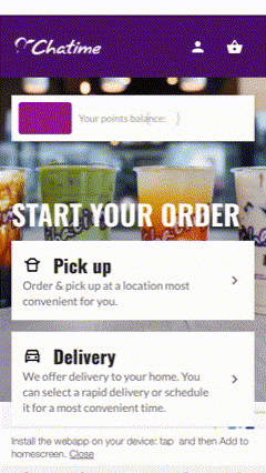
In the post-pandemic era, mobile apps have become essential tools for quick-service restaurants (QSR) to deliver seamless customer experiences. Despite its strong market presence, Chatime’s mobile app struggles with a low average rating and consistent user complaints. Customers report frustration with its inefficient ordering process, leading to abandoned transactions and dissatisfaction.
The Problem
Chatime customers are struggling to purchase drinks through the mobile app due to a confusing and inefficient ordering process, leading to abandoned transactions, customer frustration, and ultimately, a loss in sales for Chatime. So…
How might we redesign Chatime’s app to streamline the mobile ordering process from placement to pickup?


Why don’t users like the app?
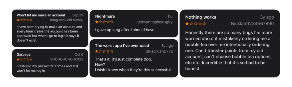
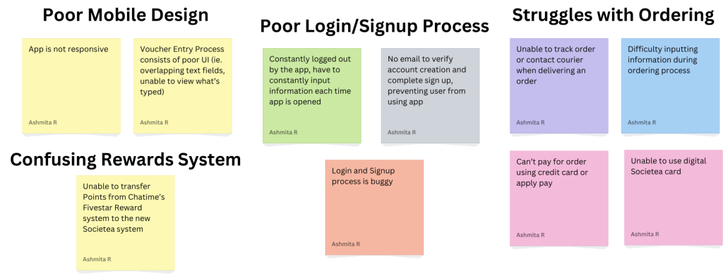
I started off by combing through all the current reviews on the app store and noted down the most insightful reviews about their struggles for each user on a set of sticky notes. To be frank, a lot of the criticism had to do with bugs within the app itself. However, there were a number of reviews that cited user pain points that can be handled through good UI/UX Design. By analyzing this feedback, I then sorted the sticky notes to identify four key paints that users were facing:
What are some common gripes with QSR Mobile Apps?
The Baymard Institute conducted 1100+ Hours of Testing on Leading Food Delivery and Takeout Sites such as Starbucks, Uber Eats, Chipotle, and Domino’s, and found a similar set of usability issues with them:
- Difficult to reorder items quickly
- Hard to adjust an order after adding it to your cart
- Lack of instructions on how to pick up your order


What do users like about their QSR Mobile Apps?
Dig Insights also conducted a study to determine what users enjoyed and wanted to see from their QSR mobiles apps. They found that users loved:
- Rewards Systems
- Personalized Coupons & Offers based off ordering behavior
- Ordering Ahead
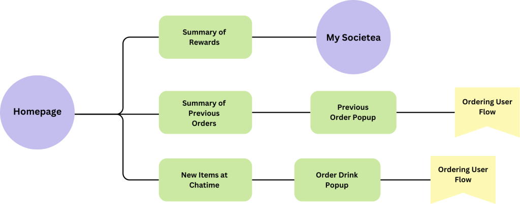
Brainstorming User Flows
Before I started to create any wireframes, it was important that I determined what the ideal user flow for a QSR mobile app would be based on my secondary research.
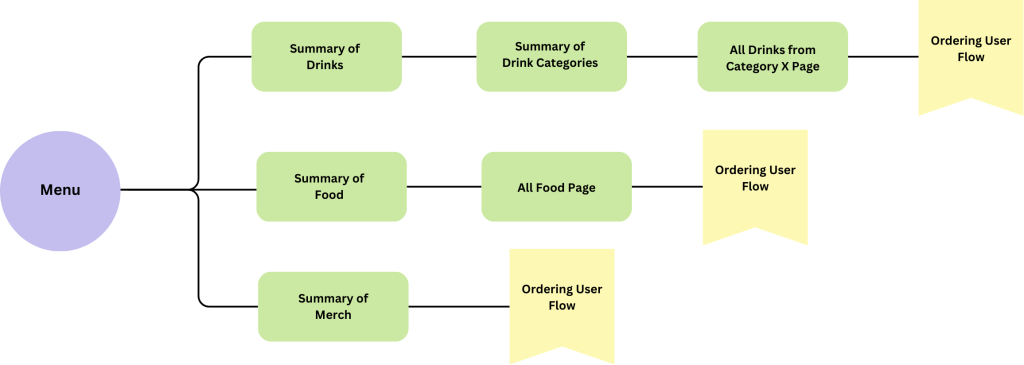

Breaking down the Ordering Flow
Something that was integral to the ordering experience as well was the ordering process. I continued to analyze the findings from my primary and secondary research and created the following flow:

Defining User Pain Points & Potential Solutions
👺 Frustrating Onboarding
Many users reported frustration with the signup and login process, citing frequent logouts and technical issues that prevented account creation. These challenges created significant barriers to using the app effectively.
🤩 Simplified Signup
Enable signups via Google, Apple ID, or phone. Allow users to save payment and location details for a smoother experience.


👺 Empty Homepage
An audit of the app revealed that the homepage lacked meaningful content, leaving valuable screen real estate underutilized. This forces users to navigate through multiple steps to perform basic actions, unnecessarily prolonging the user journey.
🤩 Hub for Key User Tasks
Redesign the homepage to serve as a hub for key user tasks. Highlight features like quick reordering, rewards balance, and personalized promotions (e.g., seasonal drinks or new menu items). This approach enhances efficiency and keeps users engaged with the app.
👺 Non-Mobile Ordering Experience
Users frequently struggled to place orders due to issues such as incorrect store selection, the inability to order ahead, and a lack of transparency in tracking and modifying orders. These obstacles led to frustration and abandoned transactions.
🤩 Mobile Friendly Ordering
Redesign the homepage to serve as a hub for key user tasks. Highlight features like quick reordering, rewards balance, and personalized promotions (e.g., seasonal drinks or new menu items). This approach enhances efficiency and keeps users engaged with the app.
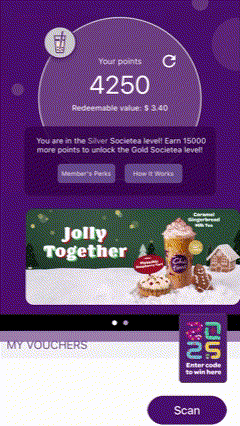
👺 Confusion with Rewards System
The launch of the app introduced a new rewards system, but users faced difficulties transferring points from the previous system and understanding how to accumulate and redeem rewards. This lack of clarity diminished engagement with the program.
🤩 Reward System Explanation
Add an in-app tutorial or FAQ that clearly explains how the rewards system works, including point accumulation, redemption processes, and exclusive benefits. This will increase transparency and encourage users to actively engage with the rewards program.
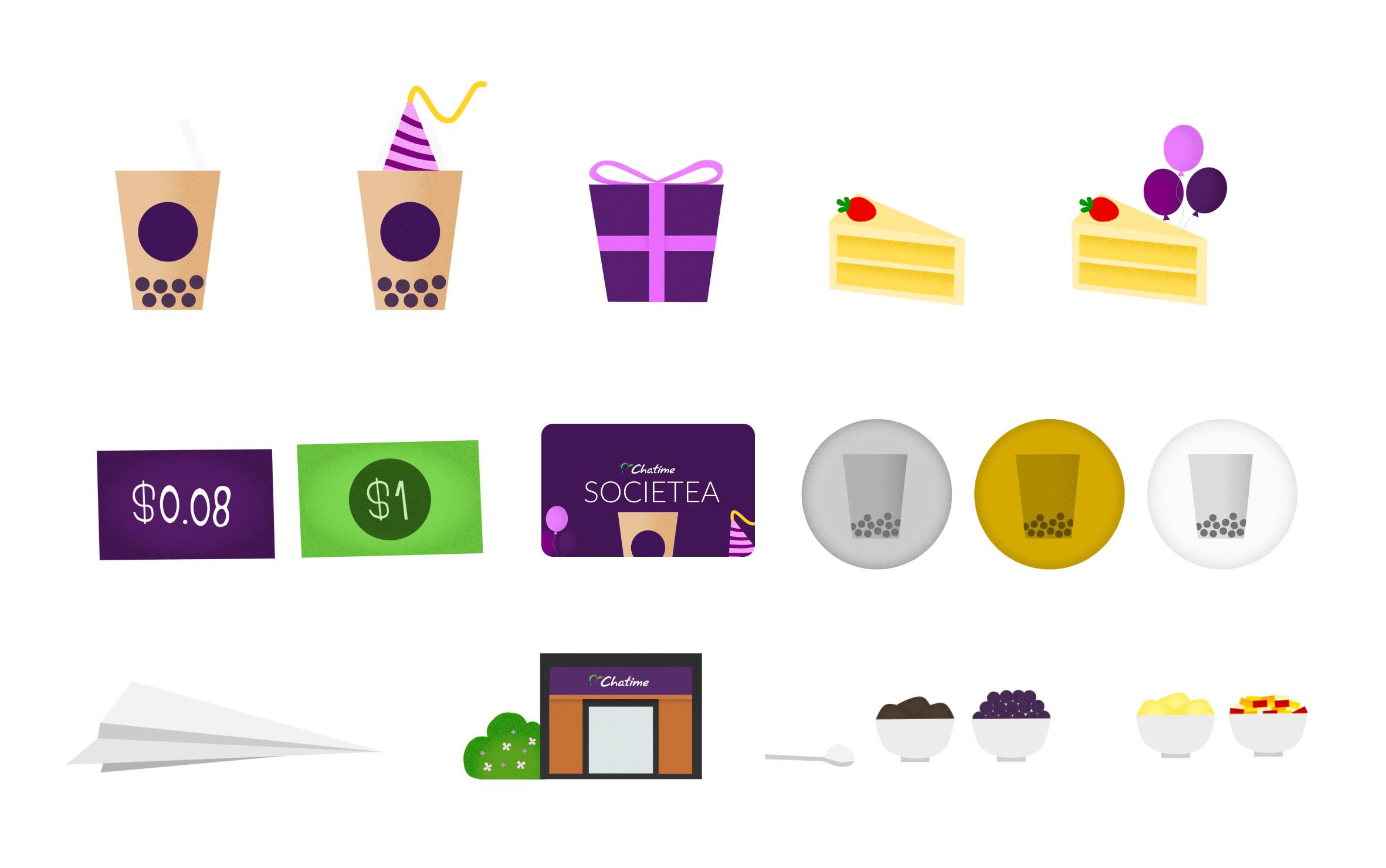
Creating Custom UI Assets
For this project, I wanted to push the boundaries of my UI design skills and create something truly unique and engaging. I decided to incorporate a textured flat design approach, which strikes a balance between modern minimalism and a playful, tactile aesthetic. This style felt like the perfect fit for Chatime, as it mirrors their vibrant, youthful branding while maintaining an intuitive interface. By incorporating visually stunning graphics, I aimed to elevate the overall user experience, making the app more enjoyable to navigate while strengthening Chatime’s brand identity.
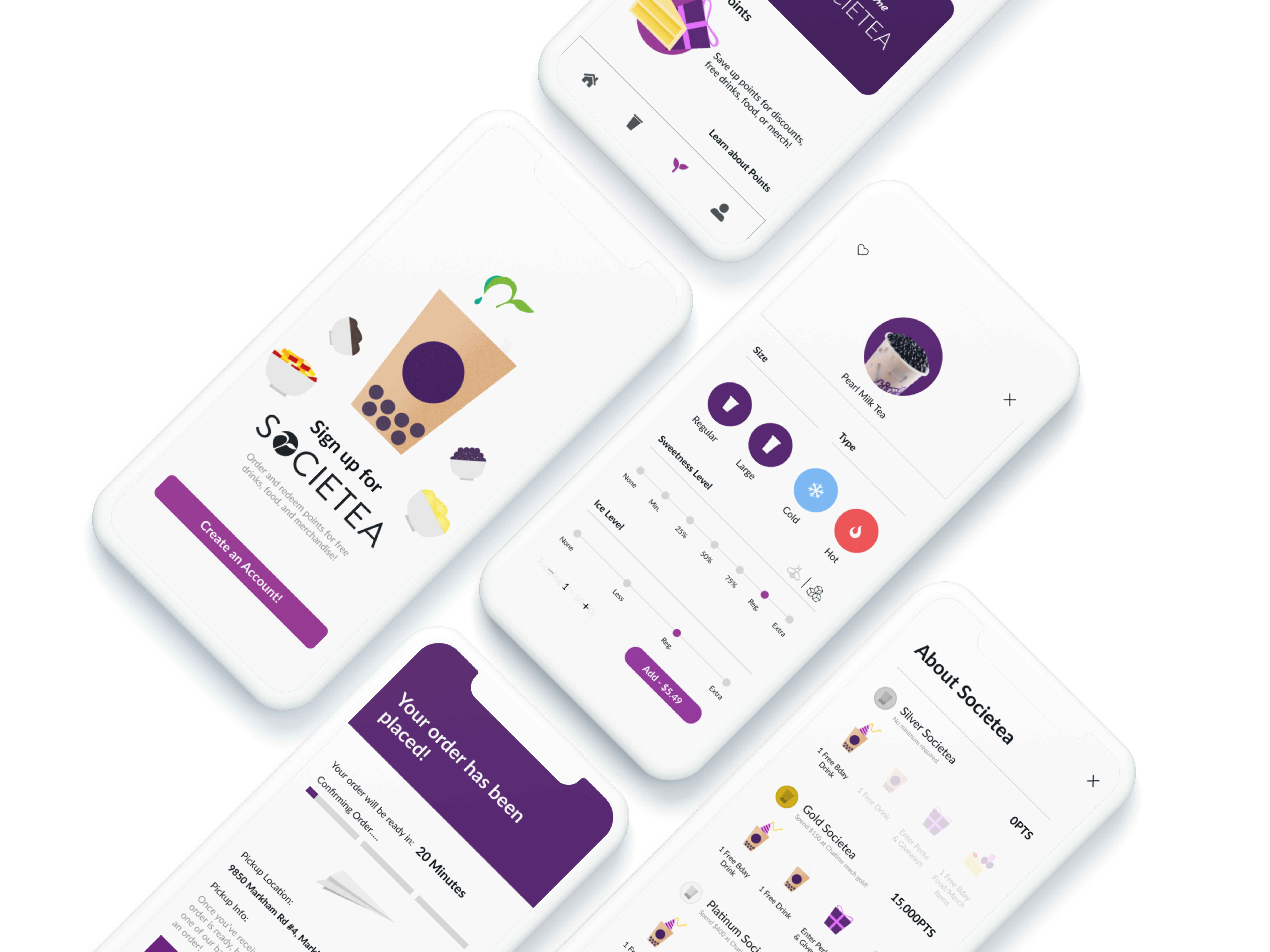
How did we redesign Chatime’s app to streamline the mobile ordering process from placement to pickup?

An onboarding process that saves key info to speed up ordering
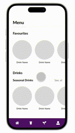
Re-order your favourite items straight from the homepage

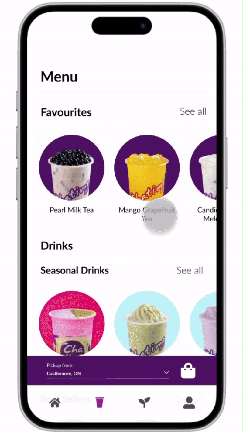
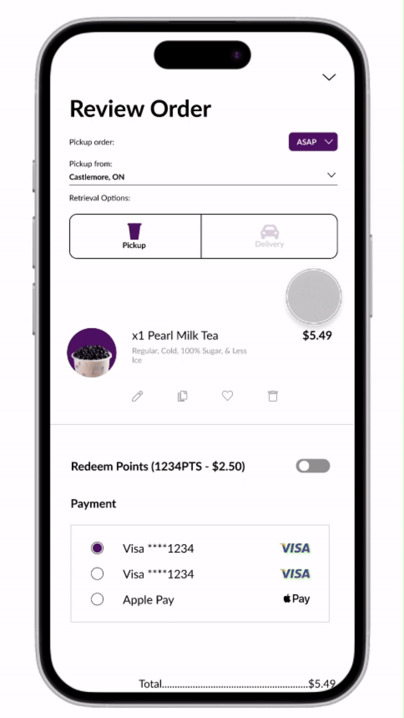
An ordering experience optimized for mobile
Track your order and receive instructions on pickup, post purchase
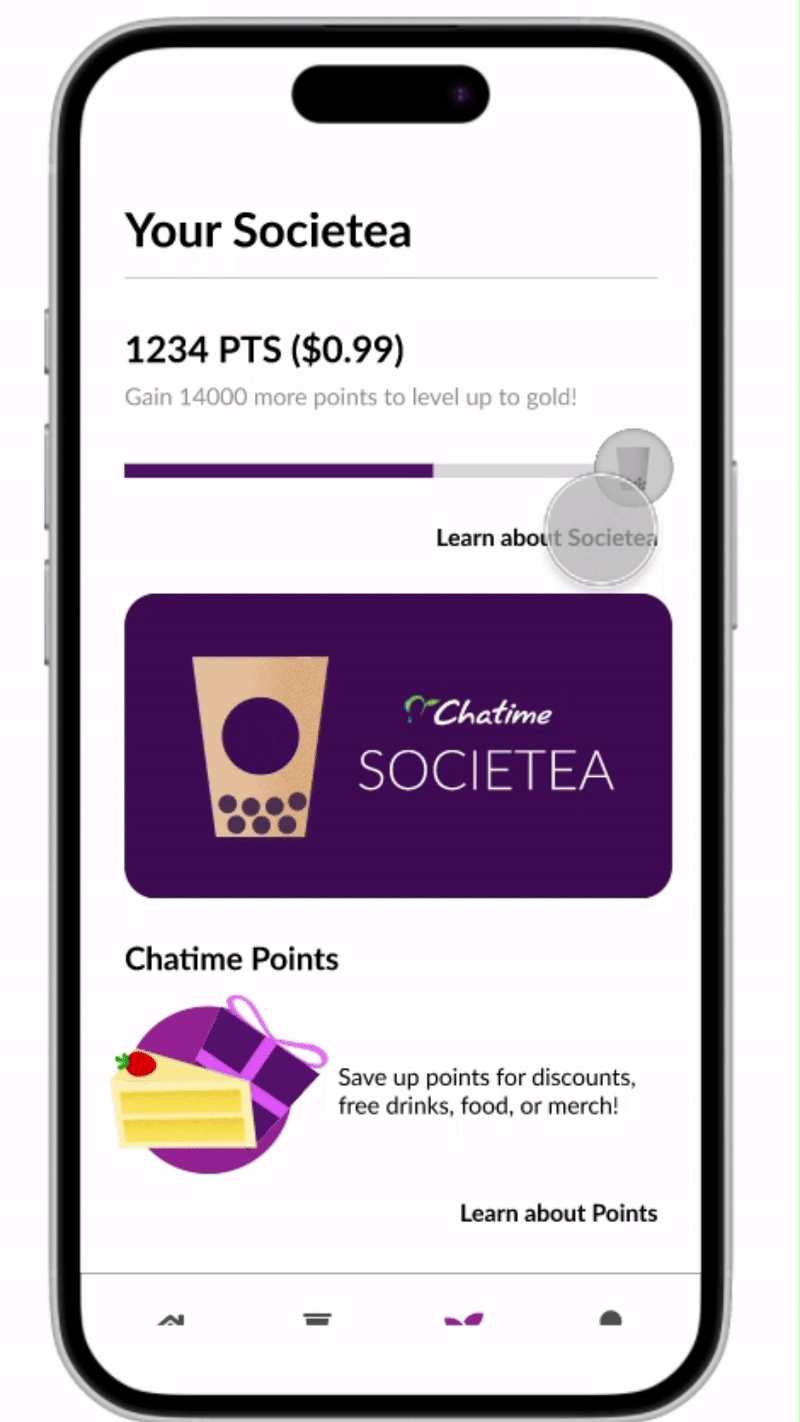
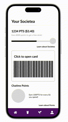
A simplified breakdown of Chatime’s Rewards with strong visuals
Key Learnings & Takeaways
Data-Driven Design: I decided to use more of my time researching current design trends, practices, and studies instead of actually designing. This really helped me speed up the design process as I was able to understand an average user’s intuition and behavior when it came to QSR mobile apps. Taking this much time to understand current secondary research also reduced the dependance on usability testing for a solo project.
UI Design: This is the first project, and honestly, the first time I’ve put any of my own graphics and illustrations into a project. Primarily being a UX Designer before this, I feel that this project also helped me understand the strength of good UI Design. I felt that the small micro-interactions and animations made the user experience a lot more memorable and ultimately took some good UX, to GREAT UX.
Find something cool?
Keep in touch with the links below!
